Conversation UI Styling
Different conversation UI styles should be determined based on many criteria, and a seemingly simple visual change can affect how messages are grouped (or not), searched, and so much more.
Introduction
Implementing the right approach to your conversational UI styling can make the difference between simply enabling users to "get the job done" and providing an outstanding experience that reduces the time needed to do the job and increases user and company satisfaction.
When considering which transcript UI style to go within, keep in mind that as a platform, we support many channels, all of which have unique ways of handling things.
One of Salesforce's value propositions is standardization across channels.
That means that if a user is able to interact with transcripts from multiple different channels (voice calls, social messages, support chats, emails, etc), there should be a level of consistency. Simply utilizing the customer-facing UI for every individual channel creates inconsistent experiences, context switching and can hinder our users' ability to do their job efficiently.
Design Resources
Download Sketch KitStyling Options
Threaded UI
In general, threaded/line-item style UI is ideal for longer-term conversations. The thread-centric design creates an opportunity to efficiently collaborate asynchronously.
For example: Slack and email use threading to group together a conversation around a particular subject.
As an enterprise platform, our customers have more complex jobs to be done around a conversation. This can involve additional participants being added to collaborate asynchronously, managers providing feedback on the way a conversation was handled, searching and filtering across all conversations to find trends, and more. Due to the nature of the Salesforce platform, utilizing a threaded UI for conversational messaging can provide a solid foundation for enabling these jobs.


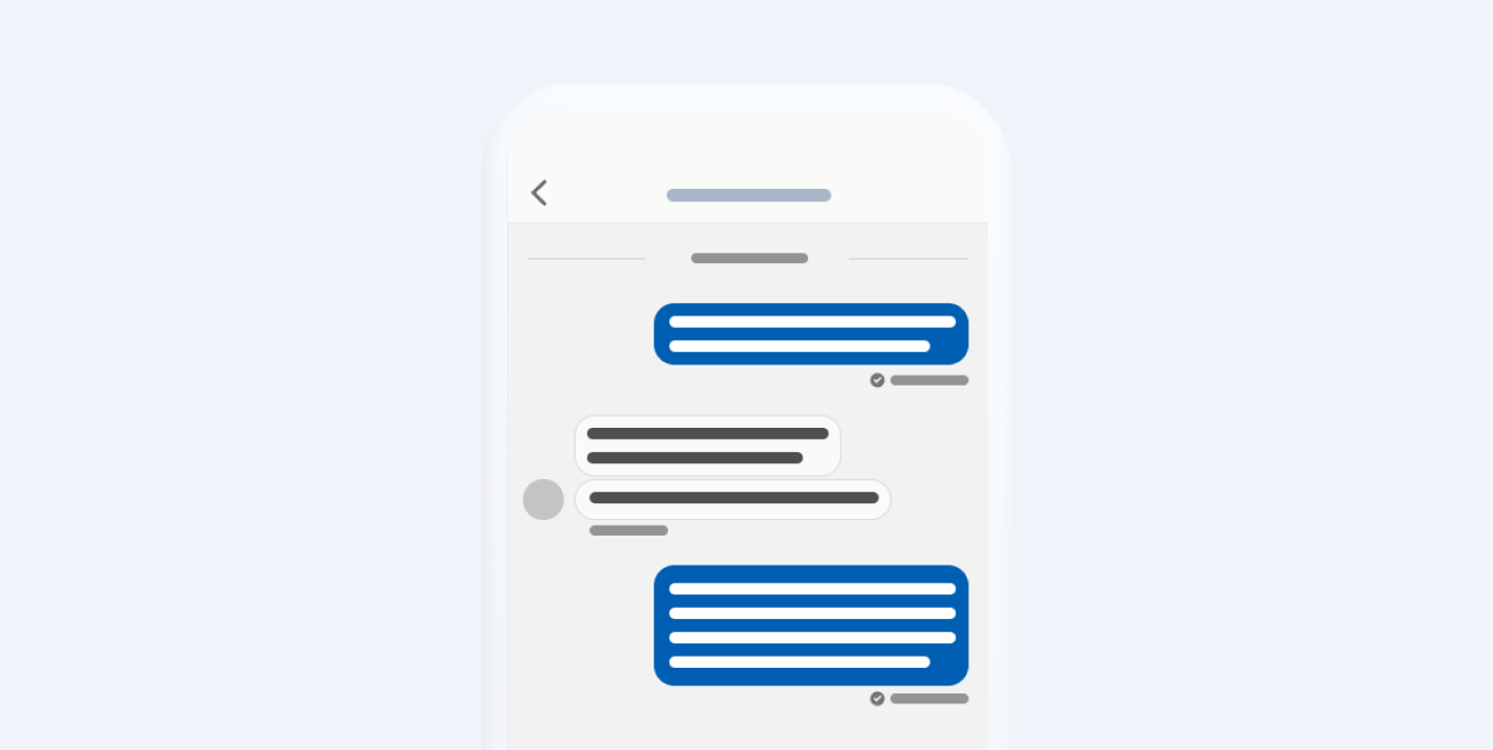
Chat Bubble
Most short-term, casual, and social interactions are displayed using a chat bubble. That makes this pattern great for peer-to-peer applications.
Think of text messages and Social Media direct messages. While there are newer patterns in the industry around "replying to" a previous message within a chat bubble, it is not ideal for more elaborate collaboration. Often, the conversation flow is interrupted and a duplication of a previous message is displayed in order to provide context for the user when "replying to" another message. In short, a chat bubble is not ideal for conversations that might require collaboration.
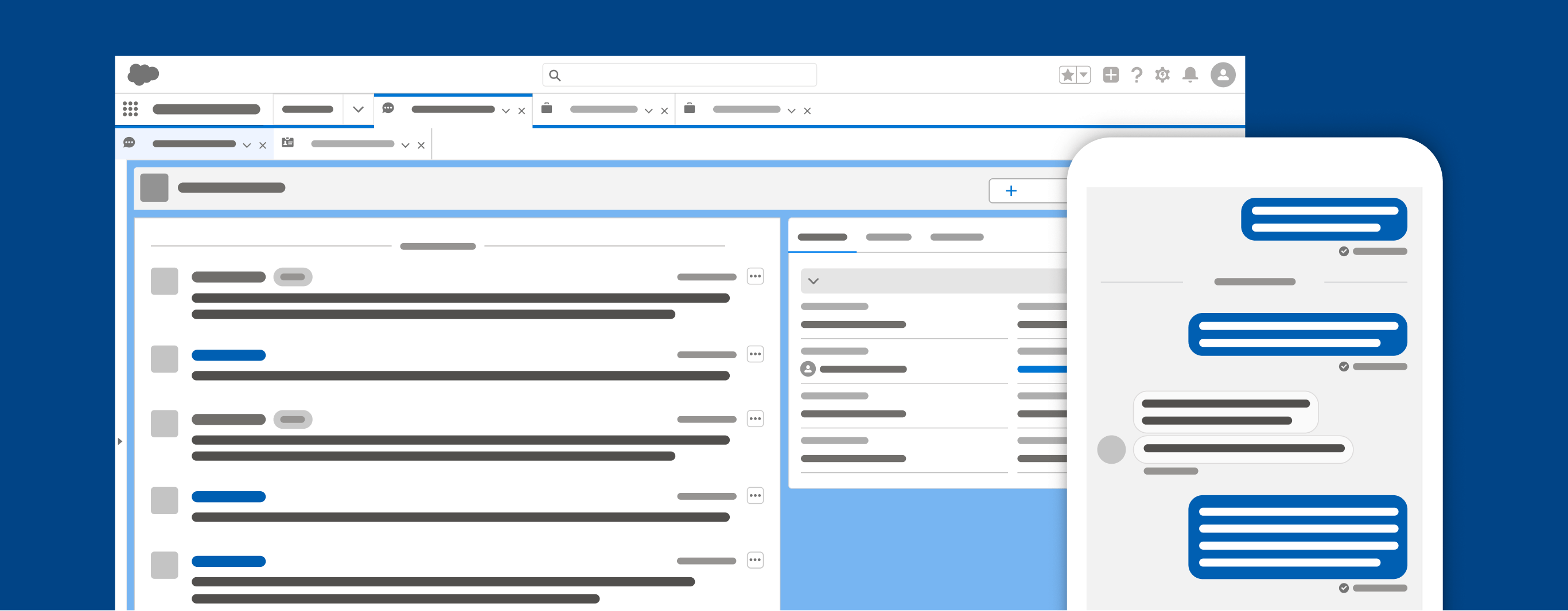
Chat bubbles can be a great solution for a customer app, while a threaded UI is better suited to handle conversations on the Salesforce user side.
