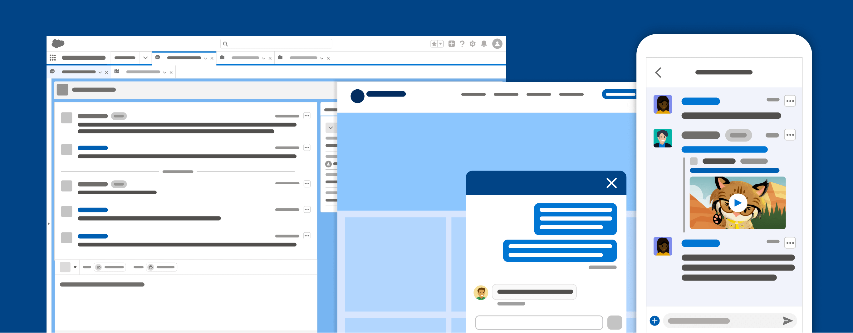
Conversation UI
Design and understand the user experience of conversations within a user interface.

Introduction
A conversation experience is any time users and customers converse with each other (generally in real-time). Conversations can be session-based with a distinct start and end, or more asynchronous in nature where participants can respond and engage through text, voice, or video, as they're available, without worrying about the session ending. This guideline will support you and your teams in creating rich, consistent, and powerful conversational experiences across Salesforce, as well as lay out a model for what conversational experiences should be across Clouds.
Design Resources
Download Sketch KitWhat's Included
This guideline covers conversation UI (what the conversation and interactive areas look like) and conversation UX (how participants engage in conversing and utilizing its capabilities). More specifically, this focuses on first-party Salesforce conversation experiences that deliver active, text-based conversation between a business and customer. Chat & Omni in Salesforce, Mobile & Web chat for customer experiences, and historical transcripts of text-based conversation.
With any conversation application, there are common features, UIs, and overall patterns that should be taken into account.
What's Not Included
We will not (yet) cover experiences outside of text-based conversations such as commenting, Chatter feeds, email, voice, or video conversation experiences. Some of the familiar patterns utilized in Slack will also not be covered in detail. For instance, threading, search, channels, pinning, and workflows will not be covered.
Conversation Design,the practice of designing language-driven interactions that live within a graphical interface or otherwise, will likewise not be covered here.